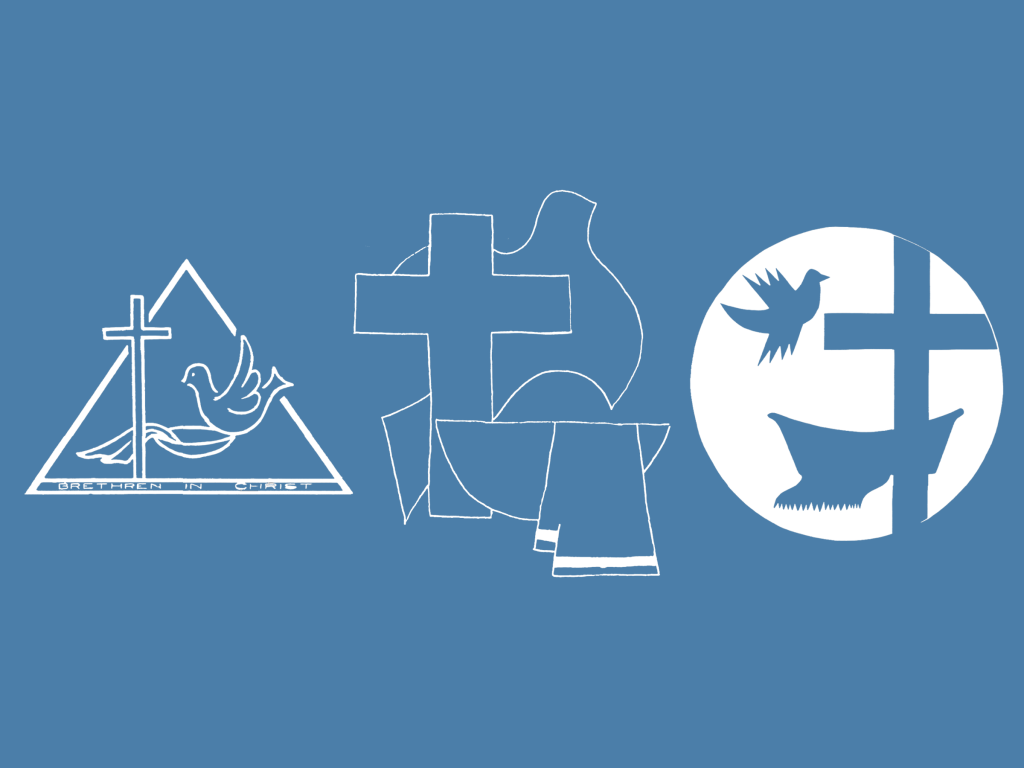
A large wooden emblem was a staple on the front wall of my childhood church’s sanctuary. It is prominent in my young memories: the cross, the basin and towel, and the dove. This emblem was not unique to my congregation but can be found in Brethren in Christ spaces around the world. This crest will be familiar to many of you for the same reason.
While the crest’s history has been documented in the past, this research has not been published for several years. Understanding our history and the significance of the elements used in this crest is important, especially as we approach 250 years of being a denomination.
Creating the Crest

The BIC crest was first created in 1972. However, the idea of a common BIC crest was contemplated years before. The Board of Missions identified a need for an “international church emblem” to use at missions sites worldwide. They brought this idea to the Board of Administration in 1969 as they believed it would be counterproductive to create their own symbol only to have the Board of Administration create a different one at a later time. The Board of Administration agreed and created a committee in 1971 to oversee the emblem’s creation.1
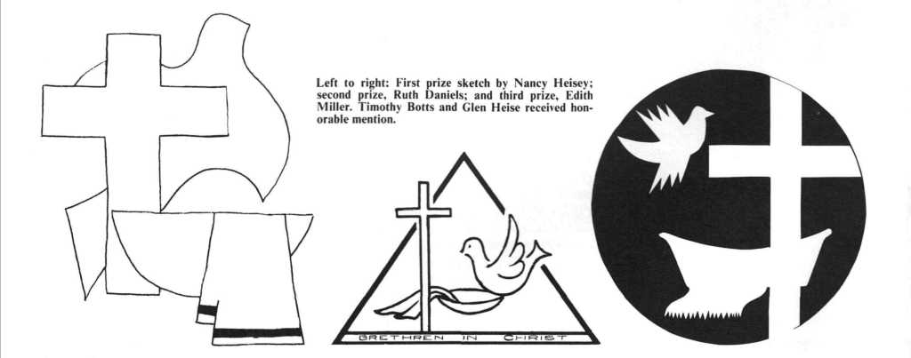
The Board of Administration wanted a breadth of creativity regarding ideas for the emblem’s design. They ran an advertisement in the Evangelical Visitor (the denominational publication from 1887-2003), inviting others in the denomination to submit their ideas for the design. The ad gave parameters for the submitted designs, including three elements for the emblem. They wrote that the design must include a cross, a basin and towel, and a dove:
- The cross “represents salvation in Christ, and is recognized around the world.”
- The basin and towel “represents Christian service, and is uniquely Brethren in Christ.”
- The dove “symbolizes both the Holy Spirit and peace.”2
These three elements were previously discussed as being core aspects of BIC theology. For example, in 1970, John Zercher wrote an article, “The Cross and the Towel,” for the Evangelical Visitor. As demonstrated by the title, this article explores why the cross and towel are powerful symbols of the Christian life. Additionally, Zercher argues these two symbols should be used in tandem, saying that “The context of [Christ’s] taking a towel was in the very shadow of the cross.”3 Therefore, these two symbols were made an essential part of the emblem. The committee added the basin to symbolize the servant act of foot washing and the dove to symbolize both the denomination’s peace position and the empowering of the Holy Spirit.
The crest committee announced the winners at General Conference in August 1972. Nancy Heisey, a college junior in France, placed first; Ruth Daniels and Edith Miller received second and third place, respectively. Karen Deyhle, a local non-professional artist, sketched out Heisey’s design and incorporated some elements from the two runners-up and other related materials. However, Heisey’s design is the primary inspiration for the BIC’s official crest.4
A Focus for the Future
Recently, a friend and I discussed the importance of symbols in our Christian faith. Symbols serve a double purpose: reminding us of aspects of our faith and pointing us back to the one whom we worship. In the case of our BIC crest, the elements of this emblem remind us of our denominational commitments and the God we all serve. Let us use this crest as an anchor to remind us of our mission, purpose, and our “God and Father of all, who is over all and through all and in all.”5
References
- Hostetler, Paul. “The Denominational Logo Revisited.” Brethren in Christ History and Life. Volume XXXIV, Number 2, August 2011. Pg.195-212 ↩︎
- Zercher, John. “Denominational Symbol Contest.” Evangelical Visitor. Volume LXXXV, Number 5, March 10, 1972. Pg. 6 ↩︎
- Zercher, John. “The Cross and the Towel.” Evangelical Visitor. Volume LXXXIII, Number 3, February 10, 1970. Pg. 4-5 ↩︎
- Zercher, John. “The Symbol.” Evangelical Visitor. Volume LXXXV, Number 16, August 25, 1972. Pg. 6, 10 ↩︎
- Efesios 4:6, NVI ↩︎
Access Evangelical Visitor archives online.

Cassie Forry is an intern with the Brethren in Christ U.S. shared services and World Missions teams. She also serves as the interim worship administrative coordinator at Elizabethtown BIC and is a student at Messiah University majoring in music and worship. While her schedule currently does not leave much space for leisure time, she loves reading, hiking, kayaking, spending time with friends and family, and pretty much anything related to music. She lives with her family and their cat and dog in Elizabethtown, PA.